Pairings App

Pairings App
A mobile app for busy students that suggests recipes based on existing ingredients and provides instructions that double as grocery lists to improve the grocery shopping experience
Spring 2017
Skills: User Research, UX, Visual Design, Prototyping, User Testing
Partner: Bettina Chou
Collaborating with a classmate, we sought to synthesize our different backgrounds and skills to design an end-to-end digital experience that improves healthy eating for busy students. We used unique research methods to understand people's grocery shopping habits and patterns to inform our app design that makes the whole experience —before, during, and after a grocery run— more efficient.
UX Research Methods and Insights
Deep Hang Out: Understanding the Problem Space
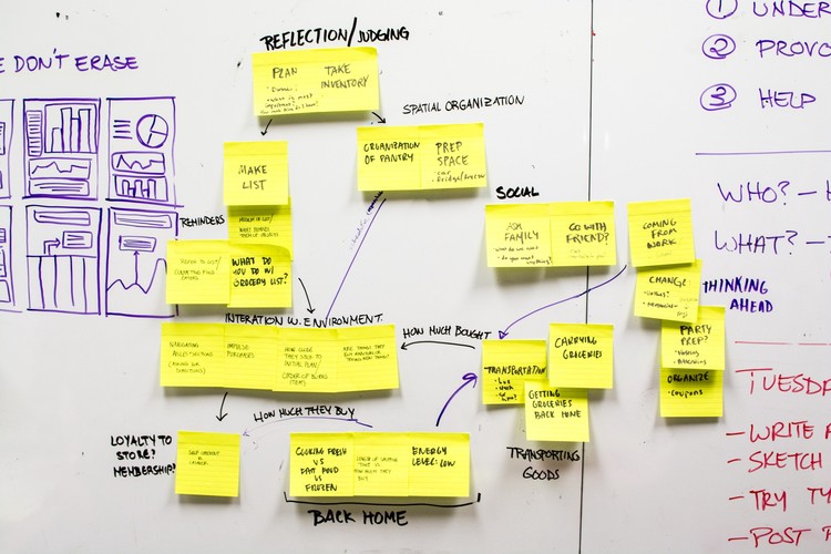
With no specific direction yet, we individually "deep hung out" at a grocery store to observe and take note of how people go about their grocery shopping experience. Below is a summary of a trip I made to Lotus Food in Pittsburgh. The main things I questioned and gained from this trip were:
How do in-store interactions between store employees and customers affect the shopping experience?
What is the experience like for new shoppers compared with old timers?
What do people use to organize their shopping lists?
Why shop at Lotus Food as opposed to a nearby/cheaper store?
What types of things do people buy routinely and spontaneously?
Cultural Probe: Understanding User Habits and Needs
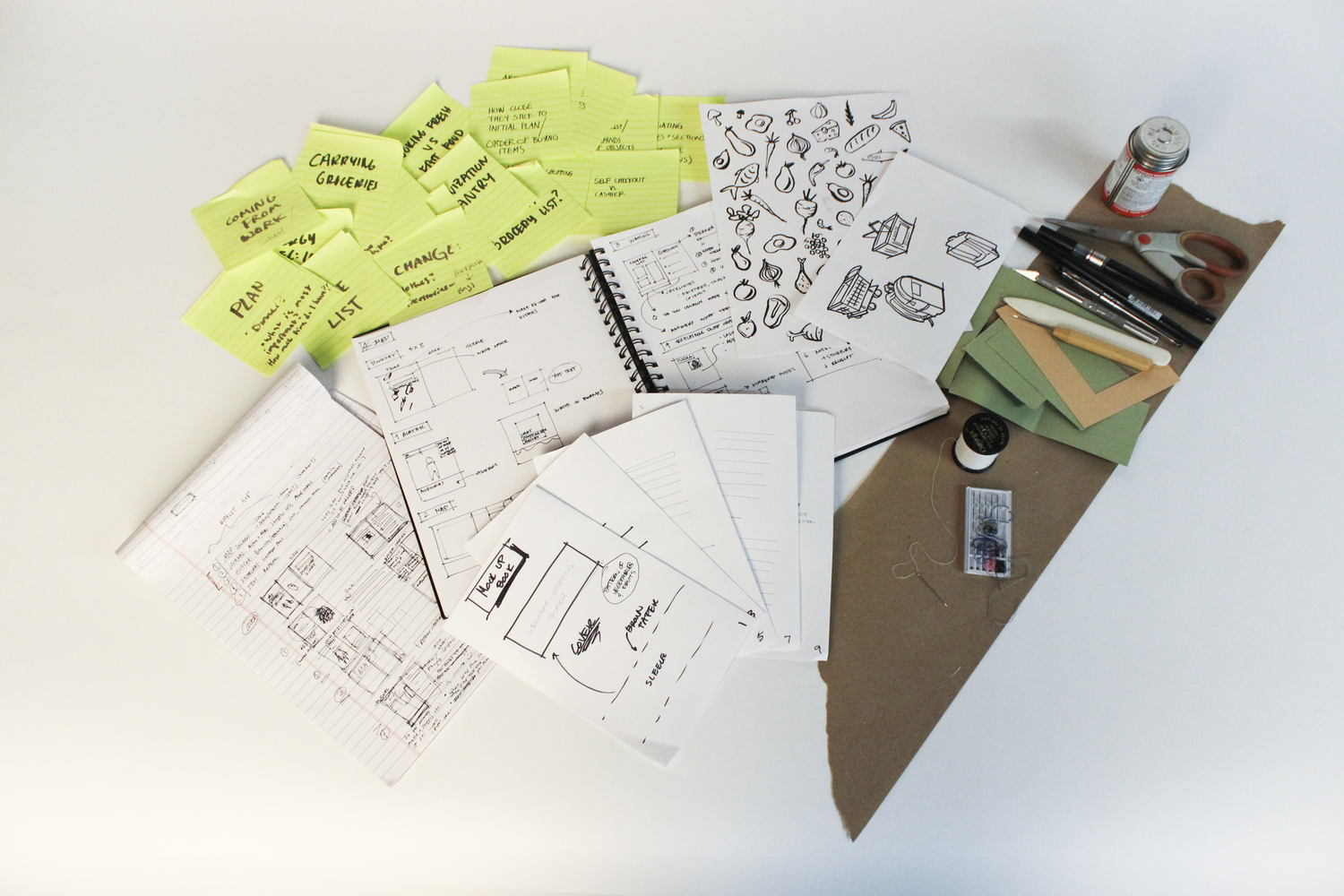
Analyzing our deep hang outs as a team, we became interested in the full shopping experience of what people do and feel before, during, and after a trip. We took key questions and points from our deep hang out to brainstorm and design our own cultural probe in order to qualitatively understand people's habits and needs at each stage of there trip.
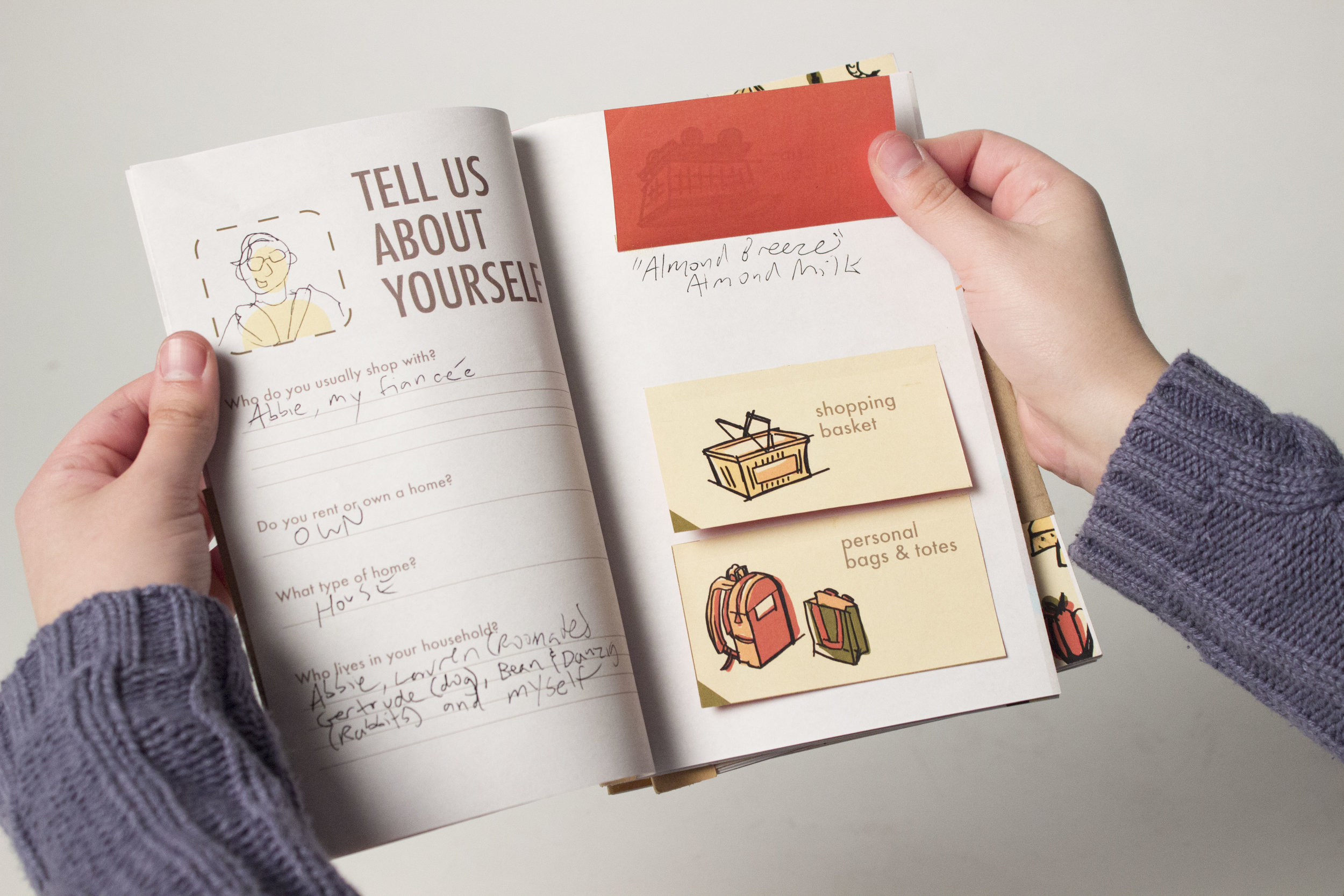
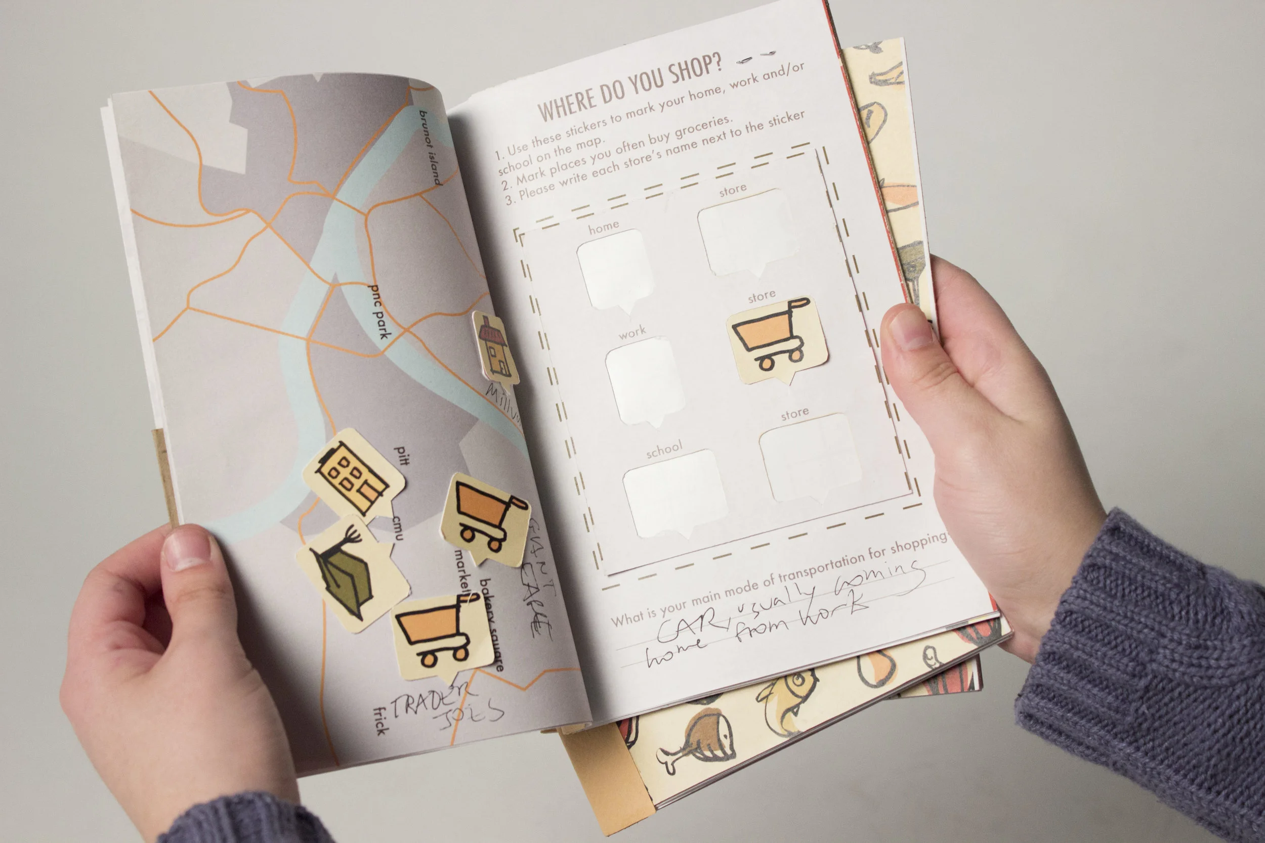
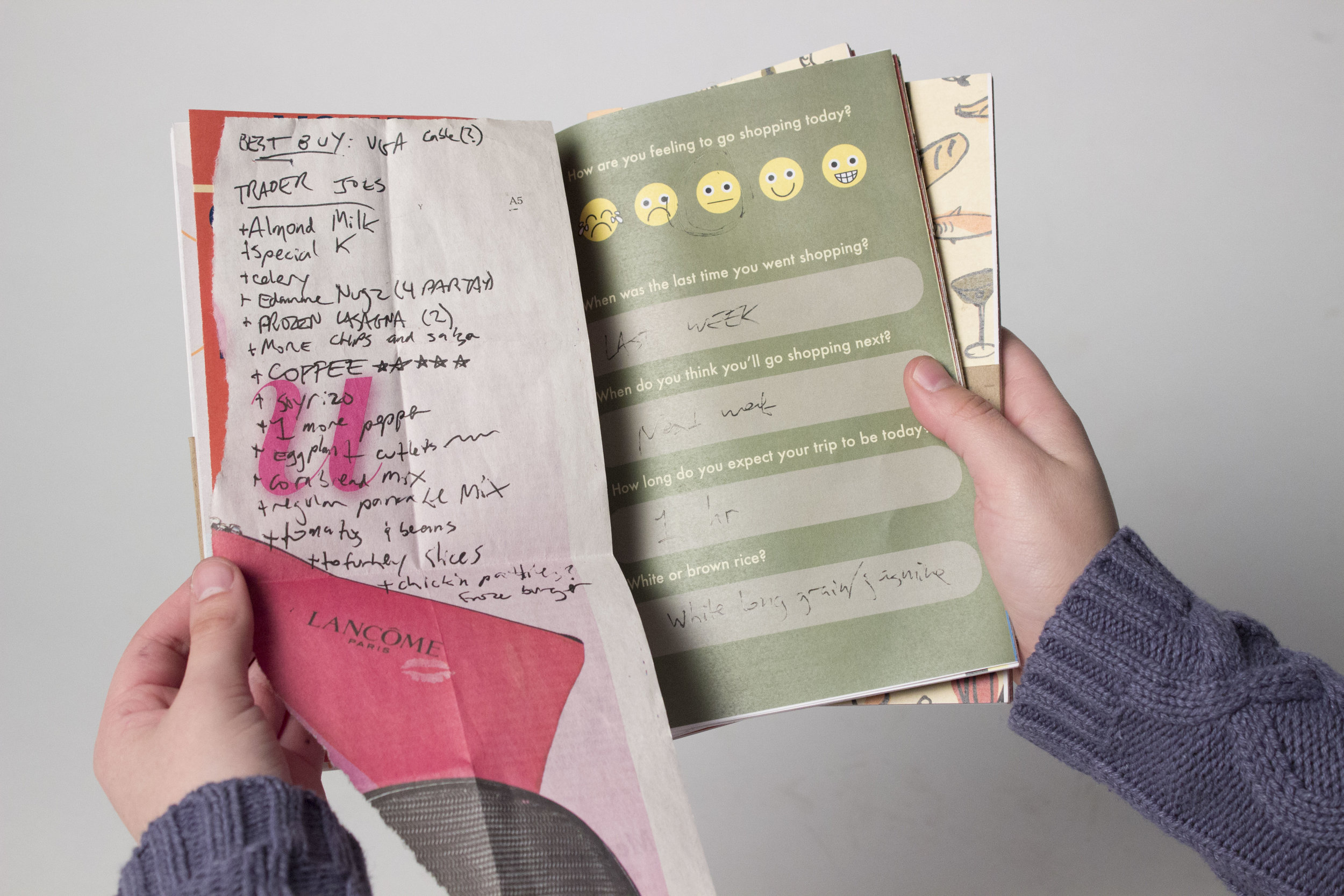
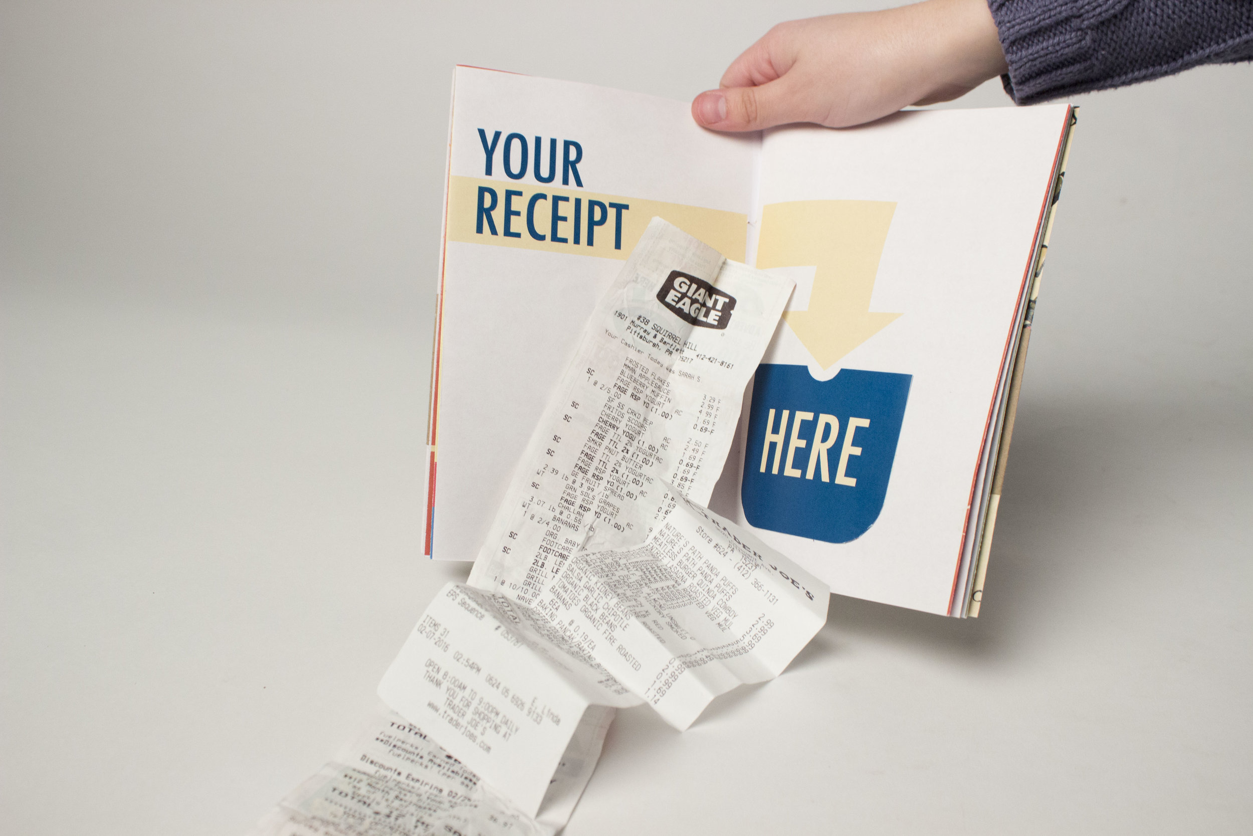
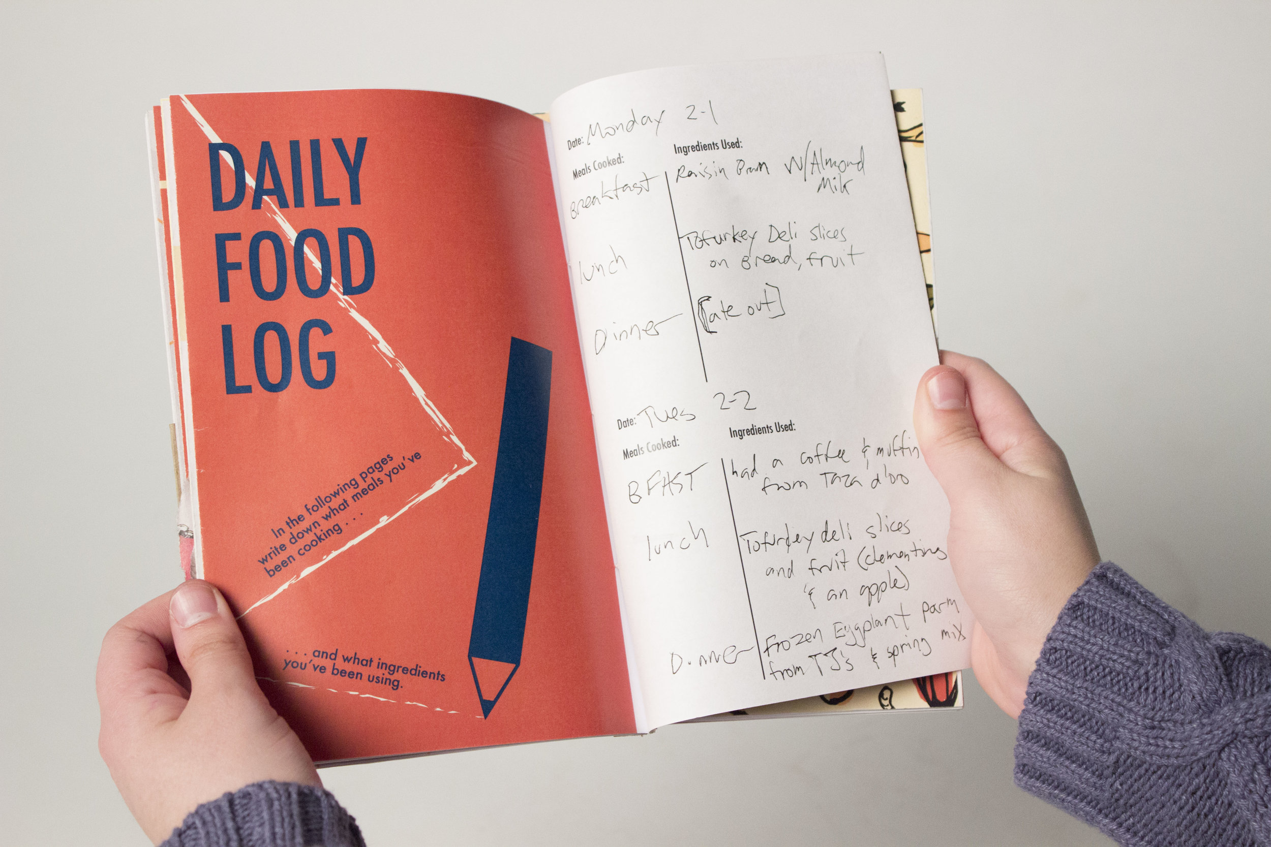
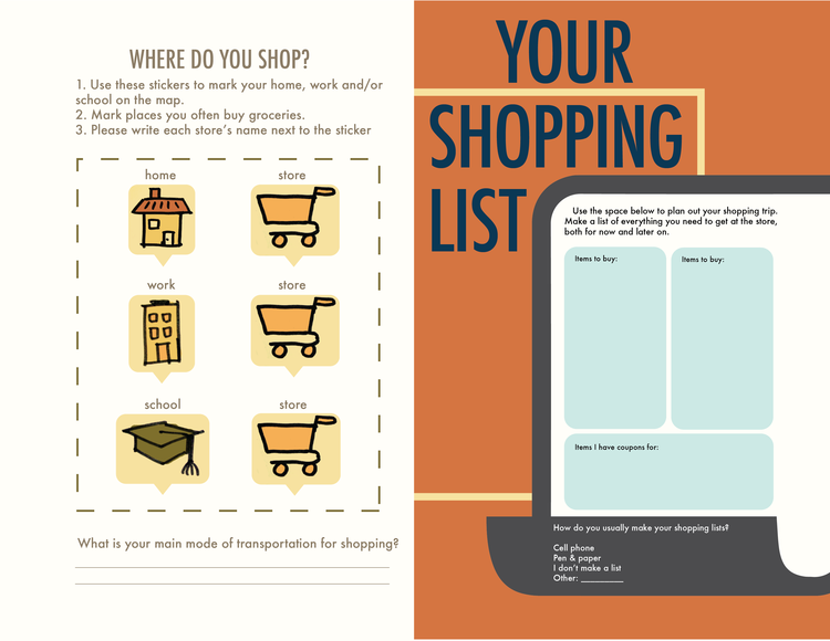
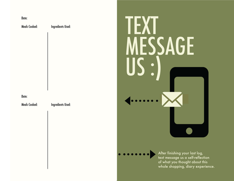
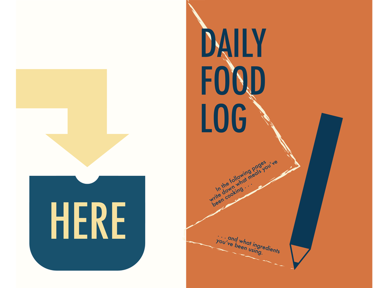
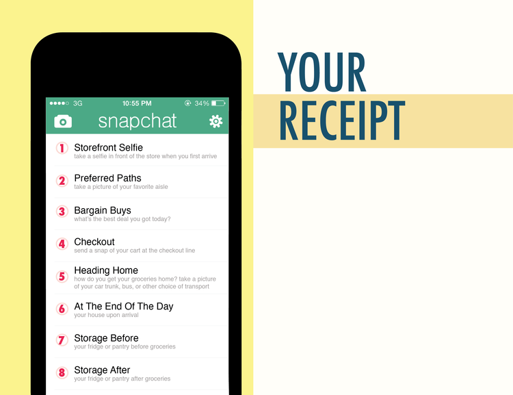
Our cultural probe was a grocery shopping diary that users could take home for a week and spend time with to provide more information to us. We gave these to 5 users ranging from students across disciplines to staff members on campus. They were prompted to fill out activities and reflections:
(before) mapping out where you go grocery shopping with stickers and who you shop with
(before) rating their general emotions about going grocery shopping
(before) listing their grocery shopping list
(during) snap-chatting us at the store
(after) providing the receipt of the grocery trip
(after) listing the meals cooked and ingredients used throughout the week
Affinity Diagramming: Analyzing Our Research
From the cultural probes, we gained many insights about user values, habits, decisions, and motivations. We categorized these insights into larger themes to address the user needs we wanted to meet.
We mainly found two contrasting types of shoppers:
those who were consistent in their shopping routine and health conscious
those who struggled with these concepts.
In general, people value (but are not always able to achieve):
time efficiency
staying organized
saving money
Problem: Busy students waste time figuring out how to eat healthy and organizing what to buy
Goal: We aimed to increase people's efficiency when planning to grocery shop while optimizing the range of healthy foods purchased.
User Journey: Potential Entrypoints
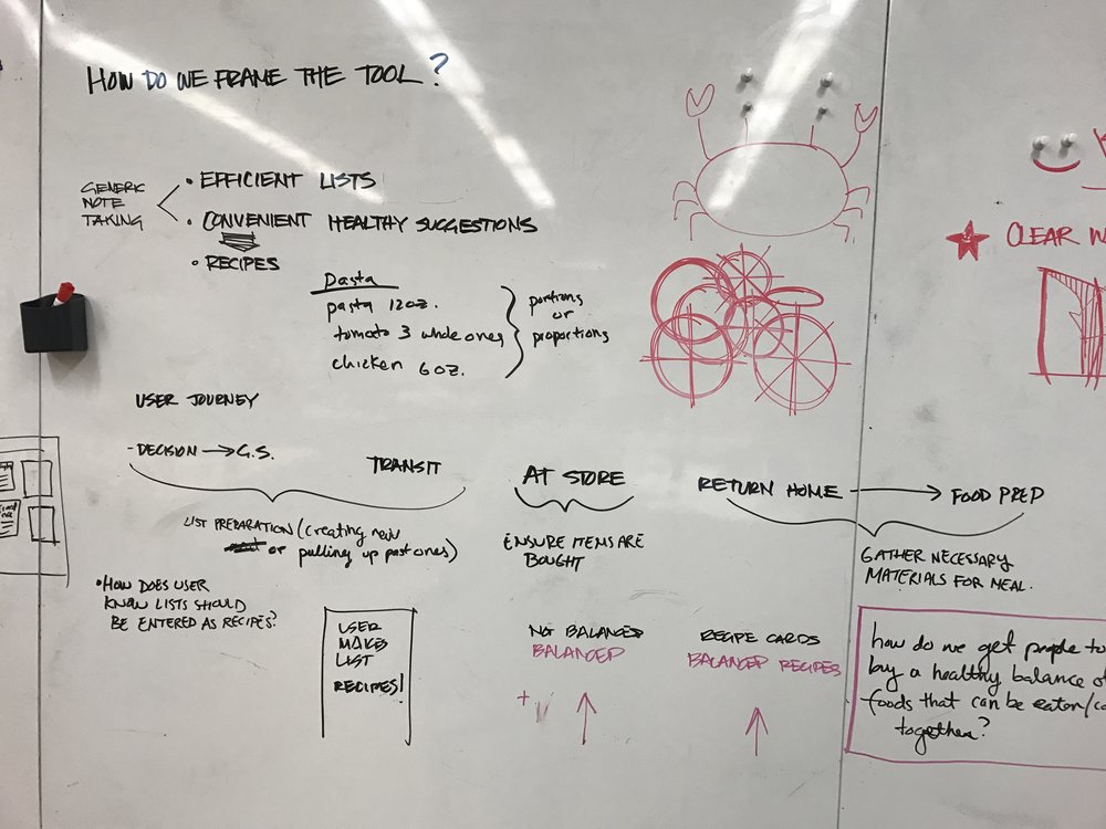
Following our affinity diagram and identifying our problem space, we drew out a user journey and saw potential entry points. We wanted to tackle why some users struggled in their grocery shopping and discovered that the planning process was their largest struggle. Our research showed that poor planning also tended to cause more unhealthy purchases and time inefficiency at the store.
Wireframing & User Testing
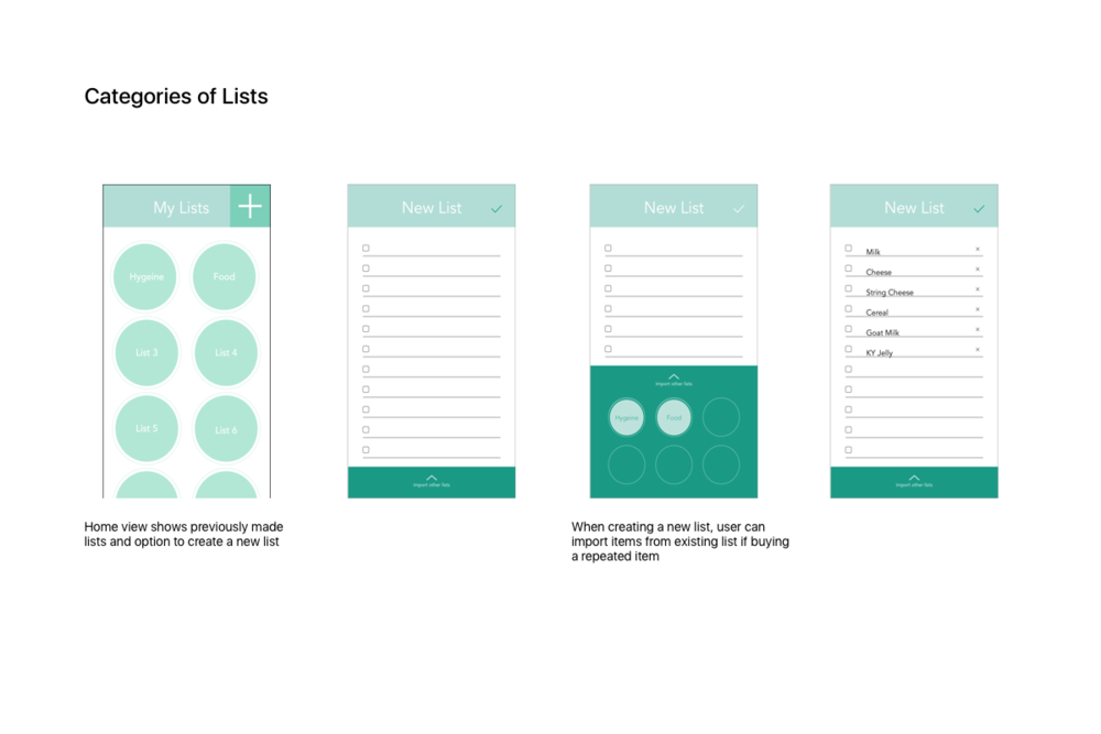
Concept 1: Categories of Lists
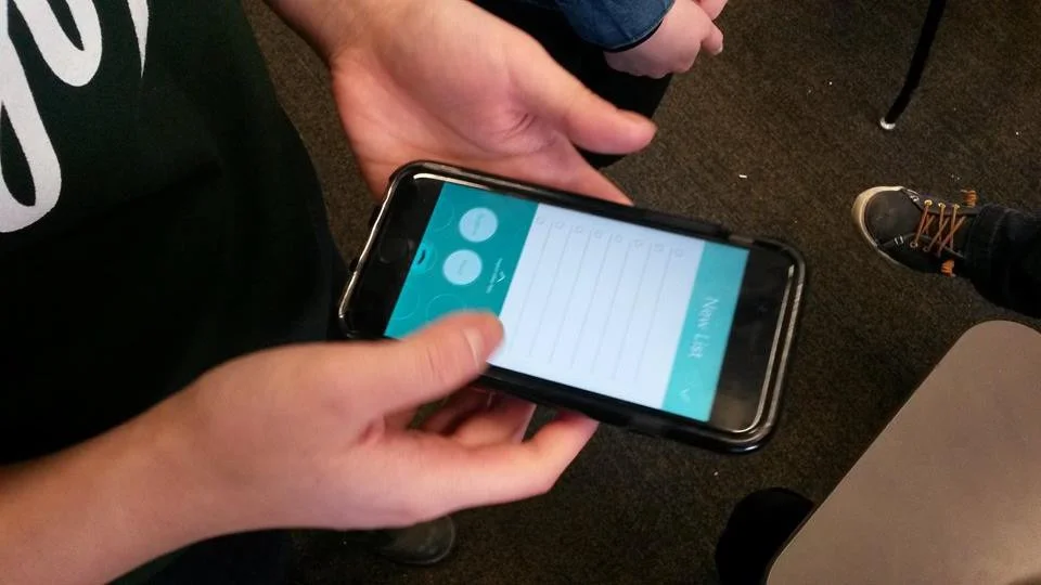
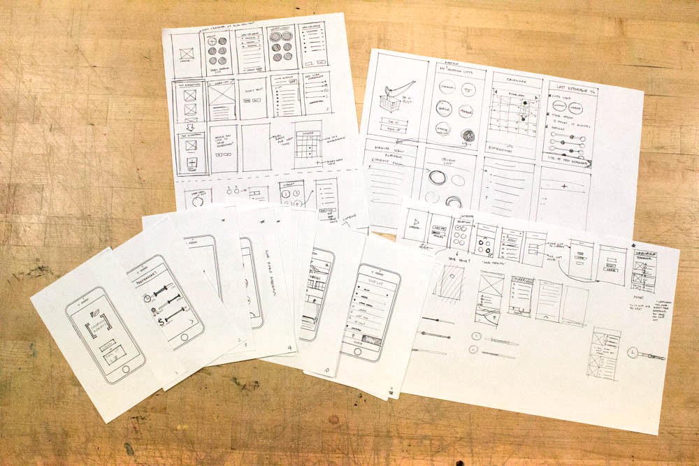
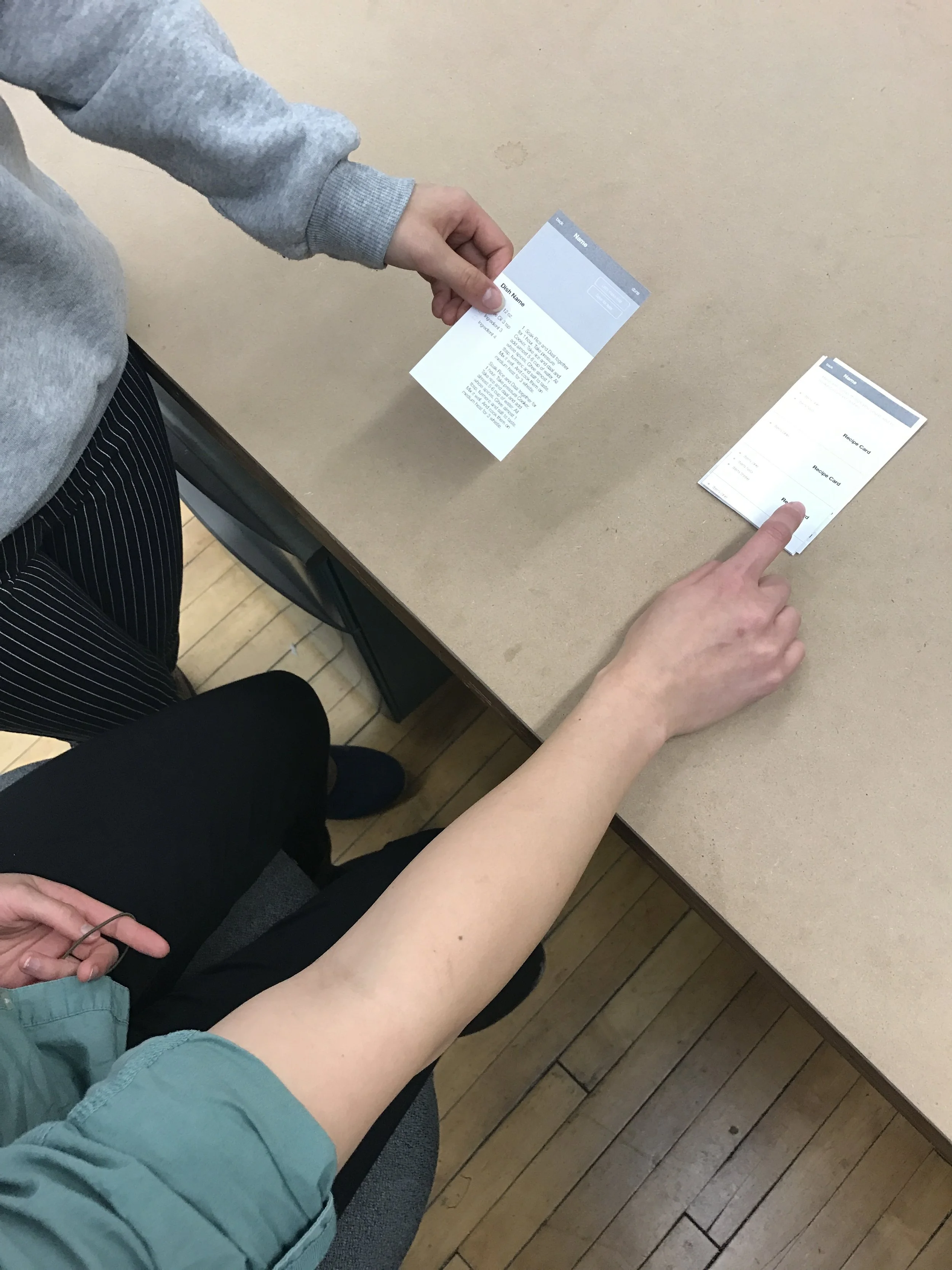
Our first concept was based on noticing that people bought repeated things. To make planning more efficient we prototyped a "lists within lists" tool where people can import previous lists to a new one.
Concept 2: Recipes, Lists, & Suggestions
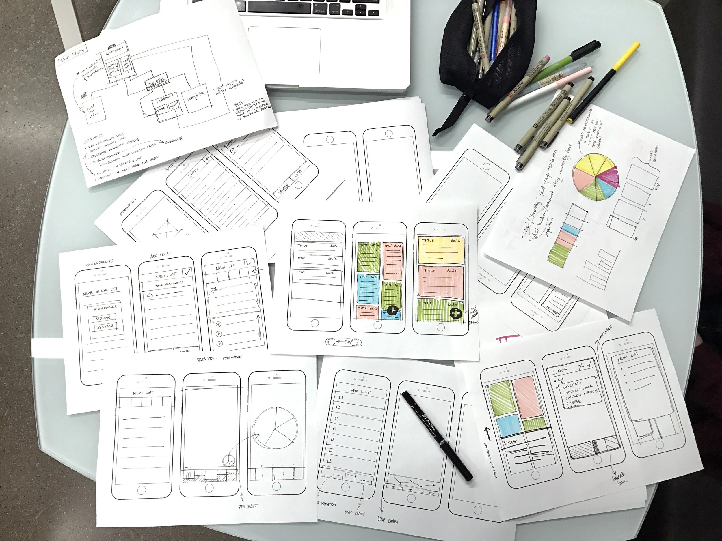
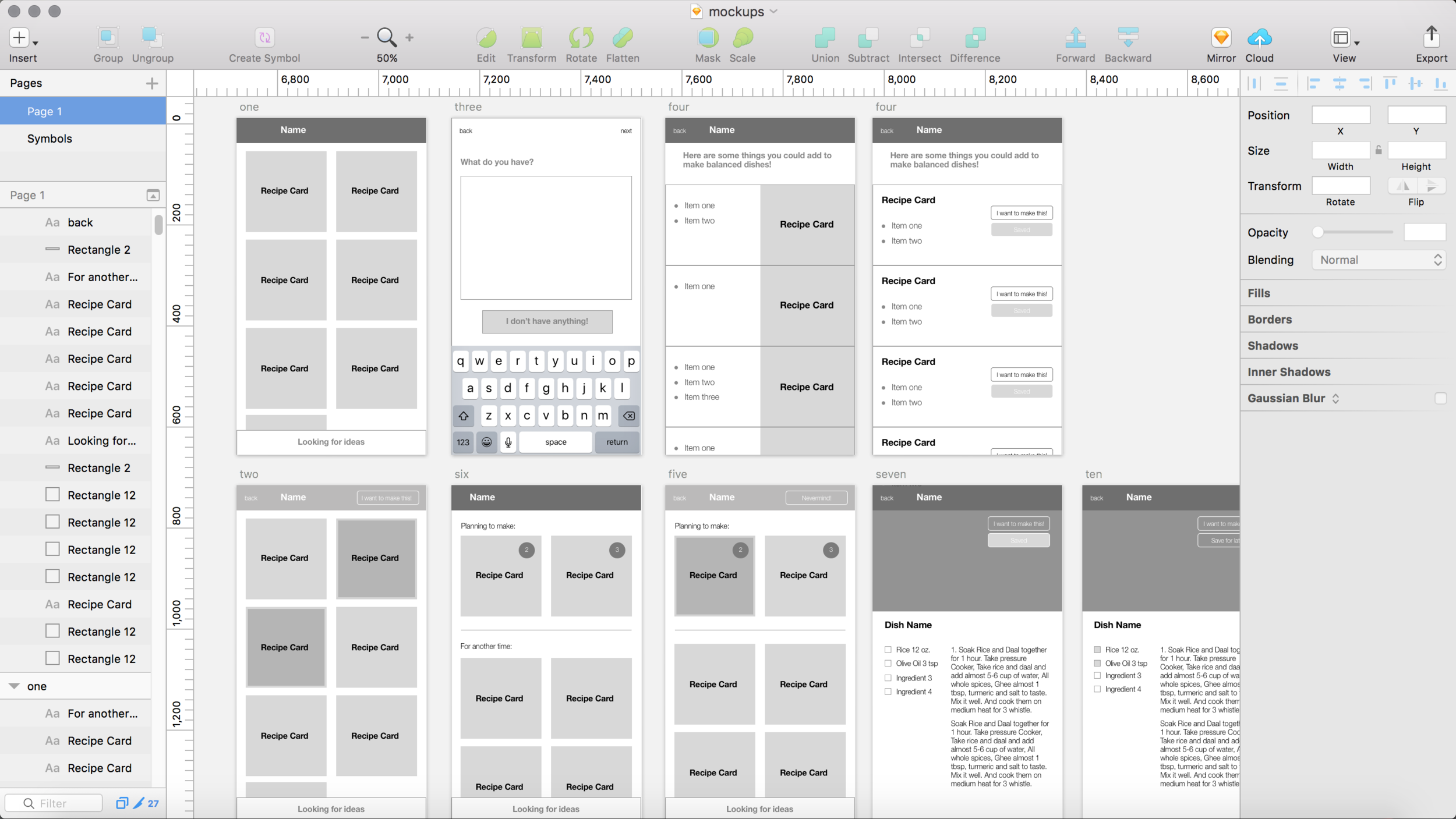
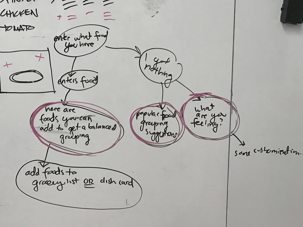
After user testing our first concept, we received feedback that combining lists is helpful but there's usually categories of things users buy for certain dishes, and a desire to make more nutritional meals. We came up with a refined concept of efficient lists for recipe suggestions.
Visual Design
We drew inspiration from fresh produce and our generative workshop to inform our color palette in order to achieve a fresh and healthy feel. While my partner, Bettina was the primary visual designer, I actively worked with her on type studies, selecting our final pair of type (Museo Slab & Open Sans), color studies, the mood board, and critiquing the fine details.
Generative Workshop - held a workshop with a few participants to understand the emotional attachment they had with certain colors, informing our moodboard
Mood Board
Style Guide
Type Studies
Reflection
I thoroughly enjoyed working and balancing design capabilities with my partner when designing end-to-end. We learned a lot about the importance of pinpointing the scale of our design intervention early on. Because we started with a deep hang out to understand and define our problem space, we could have gone many ways like designing with more emphasis on an in-store environment experience. Due to time constraints and the demographics of our user research, we decided to pursue our app design.
If I were to do this differently, I would
Do a competitive analysis to answer: where can this product live within a larger system? (University Health, Food and Delivery Businesses) For instance, would users like to see this being offered within an app of a grocery store, or would users want to have the freedom of selecting the grocery stores they go to?
Prototype and user test to answer would students feel they gain value and motivation if they see a visualization of what they buy and eat?
Prototype and user test to answer how can the search bar and food suggestions be improved?

