Type + Code

Type + Code
Fall 2015 - present
In my free time I love to experiment with visual storytelling, type, and creative computation.
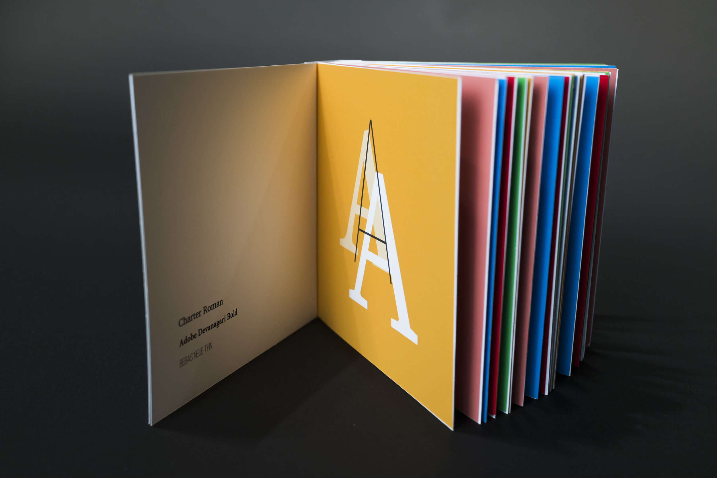
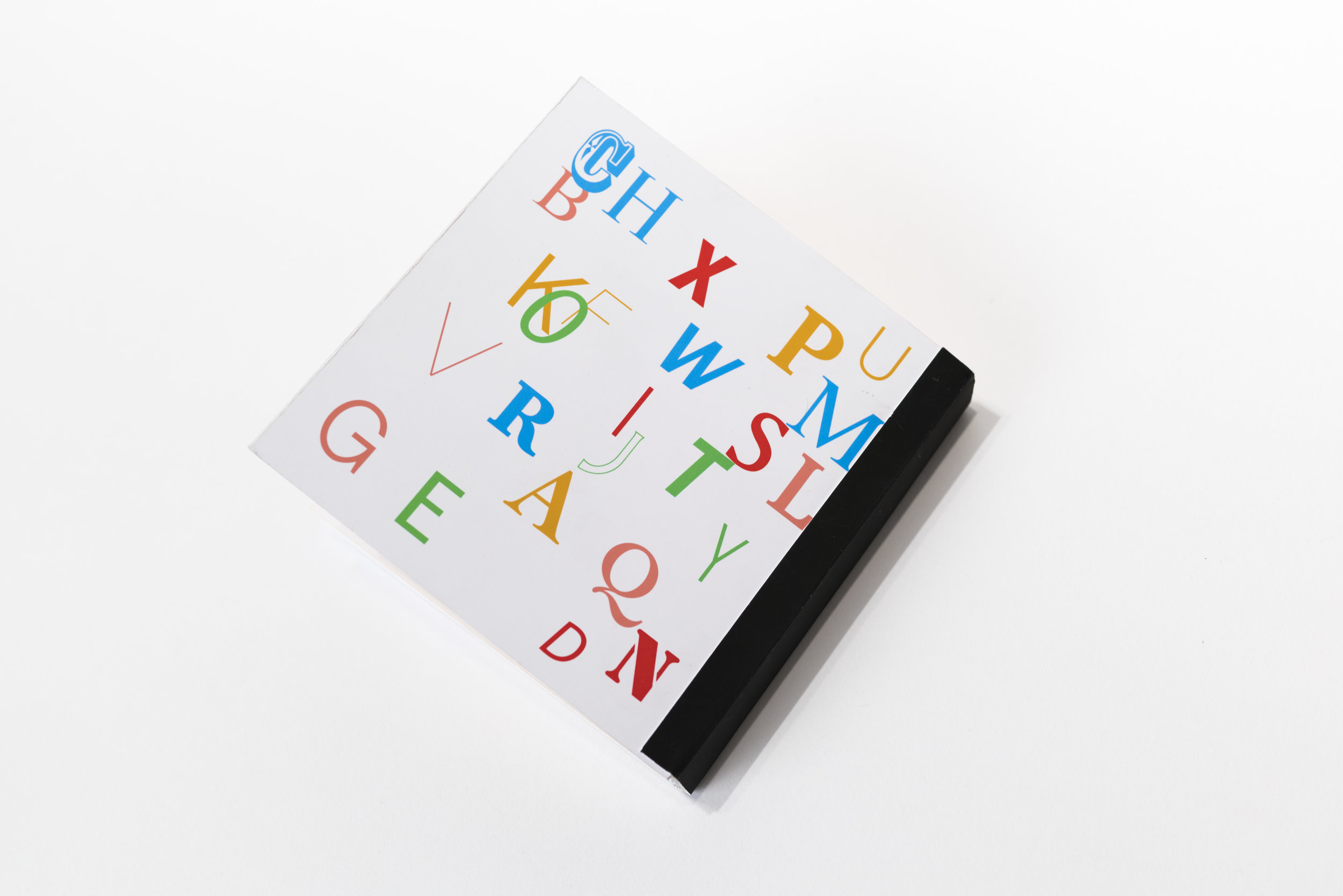
Generative Alphabet Fonts Book
Basil.js, InDesign, Print
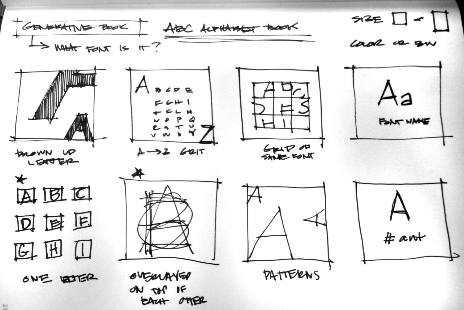
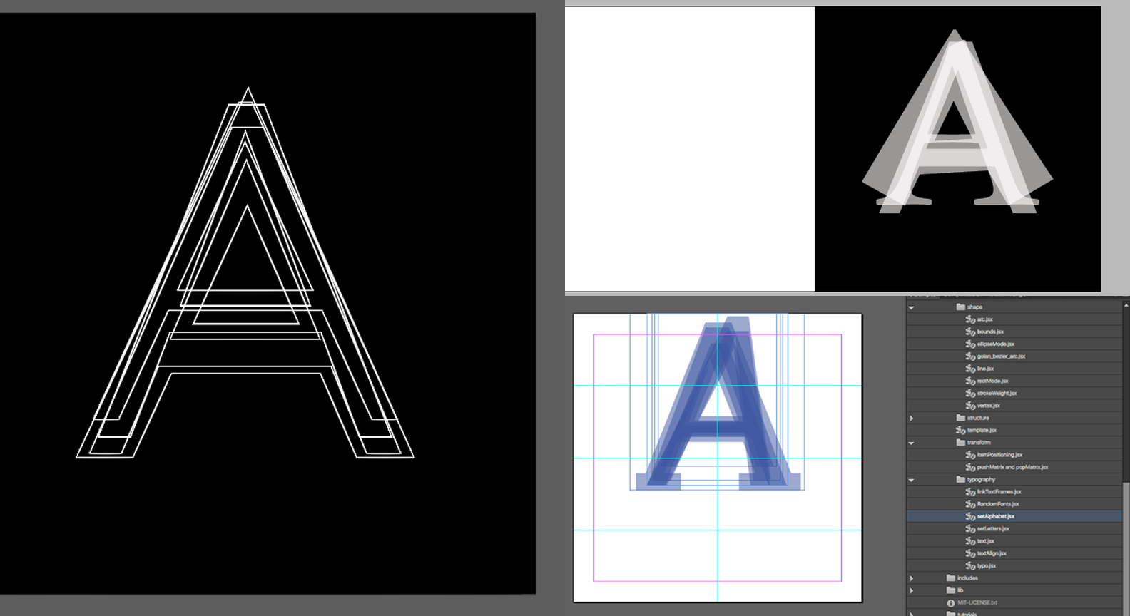
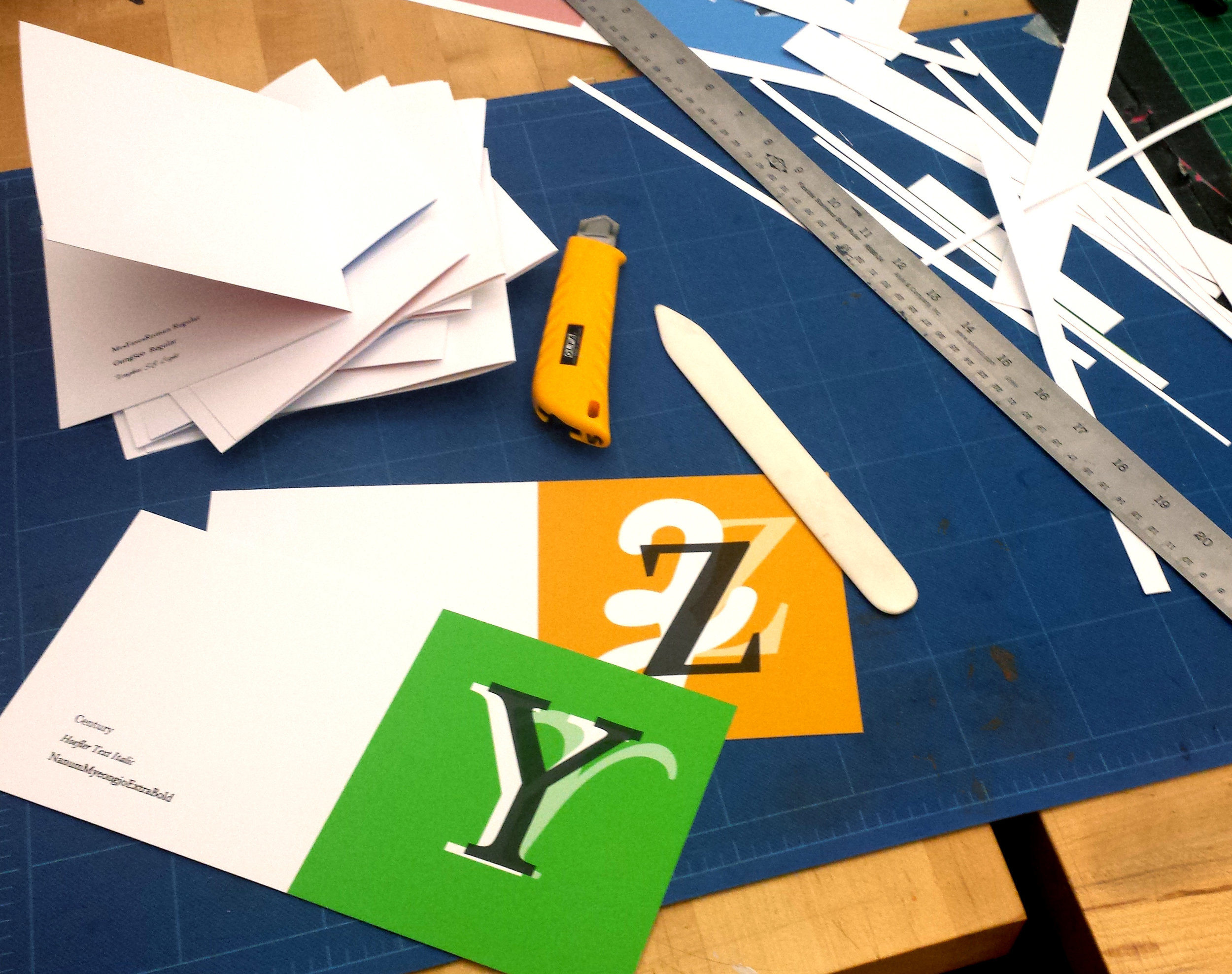
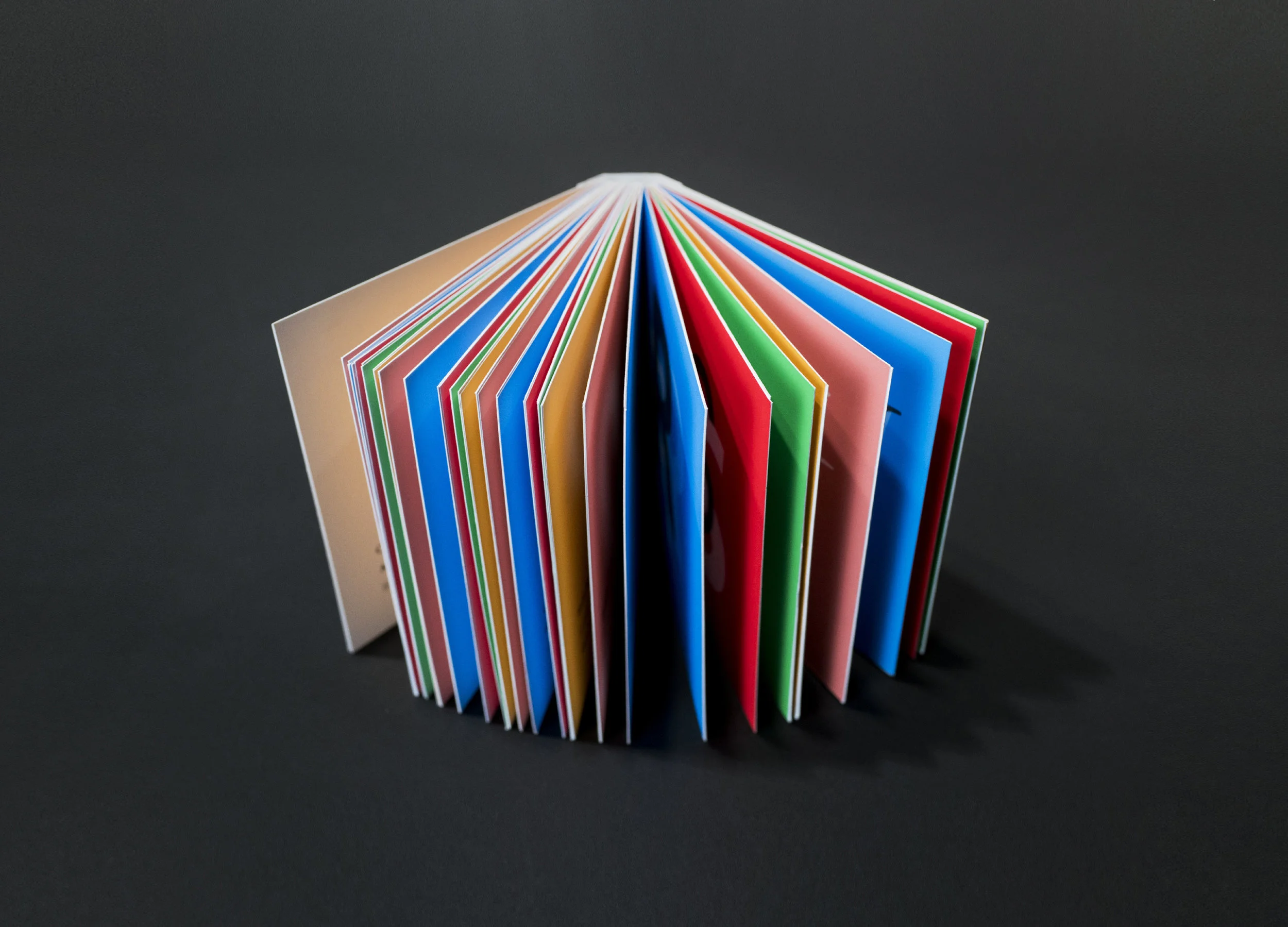
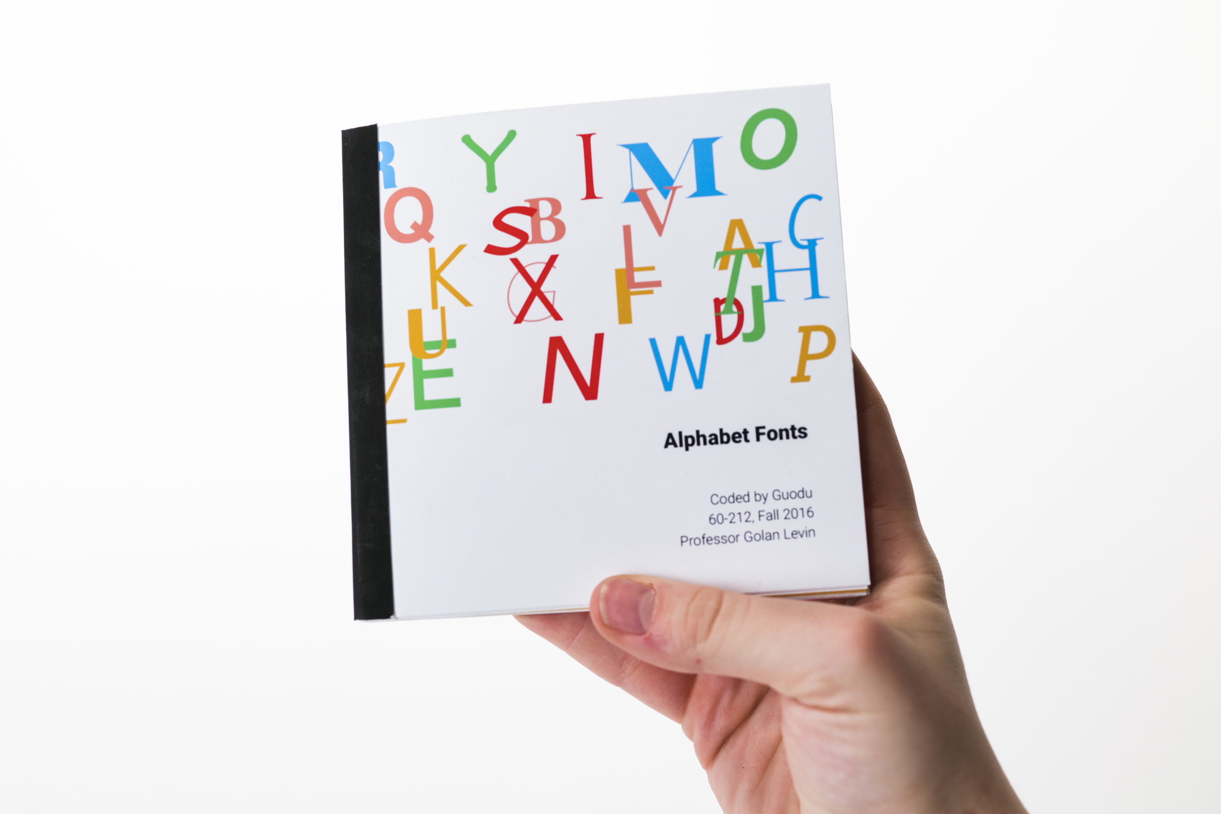
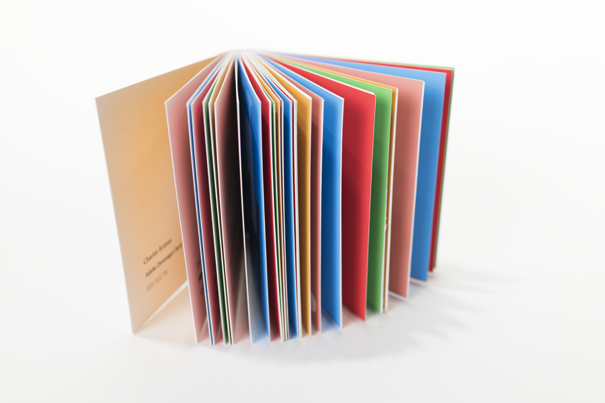
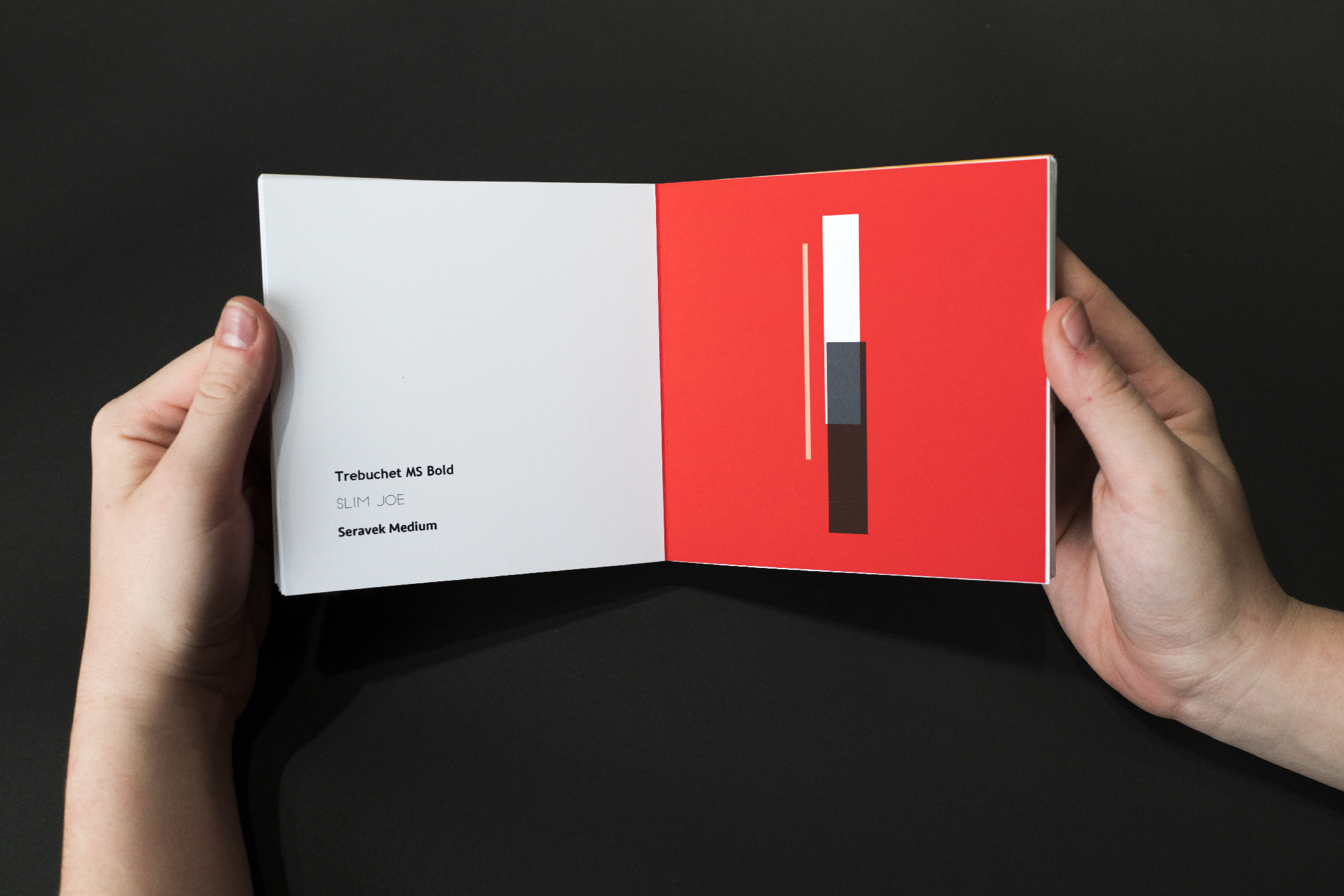
Alphabet Fonts is a computationally generated, hand bound book using Basil.js, a scripting language for controlling Adobe InDesign. My concept for this project is a baby's first alphabet book introducing fonts, and because it is computationally generated, no two books are exactly the same. On the right page there are 3 randomly generated alphabetical letters of different fonts, and on the left are the names of those fonts. I intended to not make it extremely apparent which font matched with each letter so the letters are randomly placed with a slight change in opacity and either being white, transparent white, or transparent black. In this way, the difficulty of matching the letters would prompt people to observe the letters more closely and see the subtle or extreme differences.
Please view full process, downloadable pdf, and code here.


Dog Flipbook Generator
Basil.js, InDesign, Print
Collaborating with my classmate Deniz Sokullu, we created a dog flipbook generator using a simple genetic algorithm. The computer tries to place the shapes better each time, and match the initial image provided, in this case, a simple geometric dog.
Tangible Media Exploration
LittleBits, Rapid Prototyping, Videography
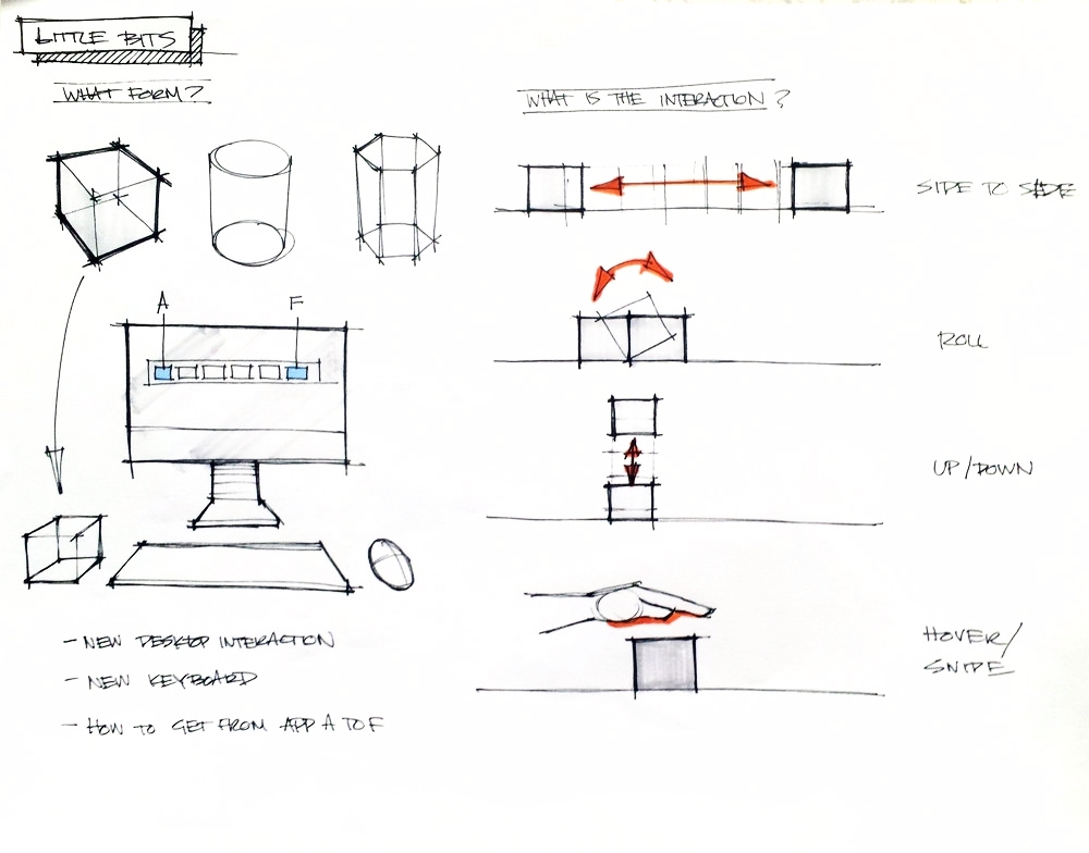
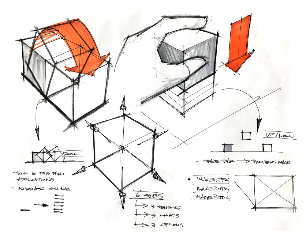
Collaborating with Cameron Burgess, we prototyped a tangible media interaction for computer input. We began this project after being inspired from Hiroshii Ishii's lecture on Radical Atoms where Ishii challenged us to think about "seamless interfaces between humans, digital information, and the physical environment by giving physical form to digital information, making bits directly manipulable and perceptible." Our flip-based "cubular" interaction prototype is our attempt at a new way to navigate computer files.
Please view full process here.
Mrs Eaves Story
Illustrator, Aftereffects
After researching the history behind Mrs Eaves, I wanted to create a video to tell the unique story behind this typeface. There was once a woman named Sara Eaves who was a mistress of John Baskerville; eventually she become the name of the typeface because it is styled after 17th century Baskerville type. The main adjectives that described the essence of Mrs Eaves and what I hoped to convey in my video were: open, elegant, romantic, and mysterious.
Beatnik
Photoshop, Charcoal
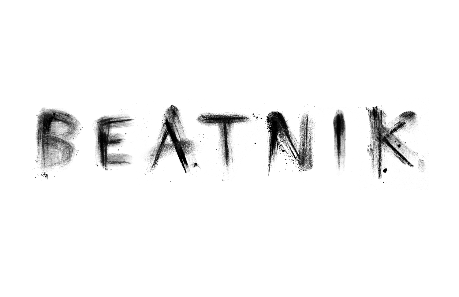
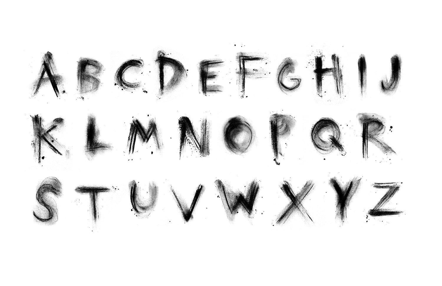
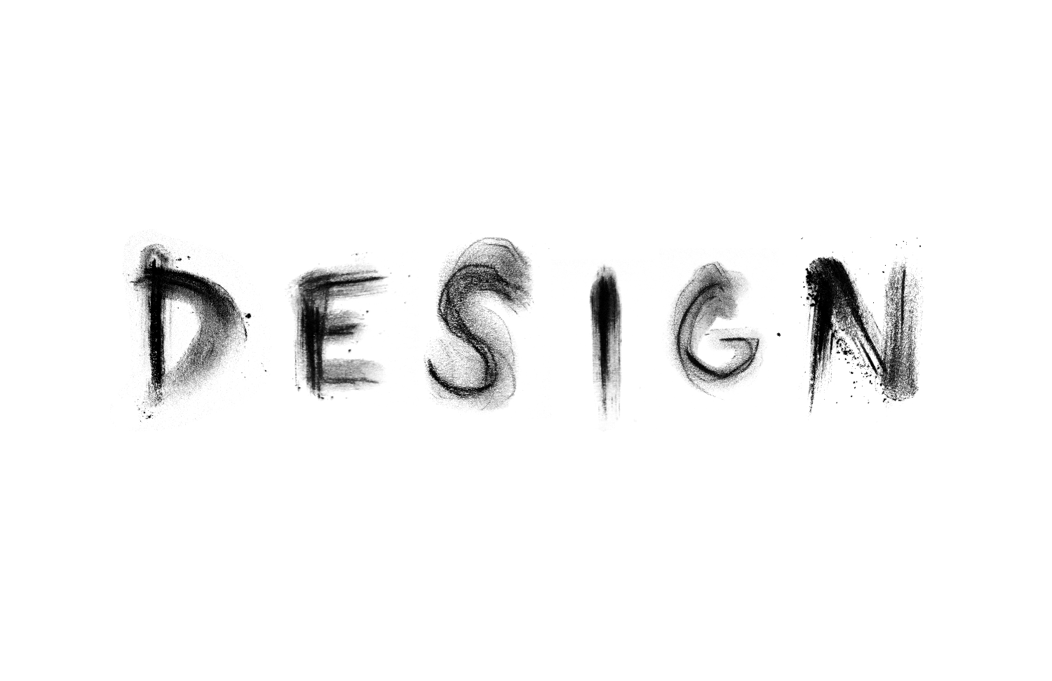
My partner, Lily Fulop, and I collaborated on a typeface that embodies the medium, charcoal. Instead of just using charcoal to write each letter like a pencil, we wanted to make a typeface that felt like the experience of using charcoal. What makes charcoal different than working with other mediums? We did a lot of experimentation to find out all the marking qualities Charcoal has. We found it to be extremely versatile and variable and believe our final typeface conveys these qualities.
Lily came up with the name "Beatnik", a fitting cultural reference. The beatniks of the 50s and early 60s had unorthodox lifestyles, wore dark clothes, lived on the fringe of society, appreciated art, and contributed to alternative culture. We felt like beatnik was a match for our font, which is dark, grungy, and references art. Beatnik doesn't play by the rules. It's loud, messy, and unapologetic.
